Introducing... Safety Curtain
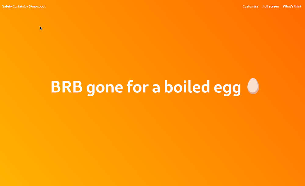
I launched a new micro-product this week. It’s called Safety Curtain! It’s a website where you can display a message of your choice, over a nice background. You can see it here:
It looks a bit like this:

OK, so you might be thinking, “What the heck is this, Tom? Is this something you found in a beginners’ JavaScript tutorial?” 😆 And to be honest, you may be right.
But there is a story behind it! It’s a tiny product, made mostly for fun, to learn and experiment.
Read on to find out more.
It began… in lockdown
At the beginning of lockdown, I did a couple of remote consulting engagements, where I was doing code-pairing sessions with customers, using screen-sharing (we use Bluejeans).
They were pretty long days, and we had a lot of work to do, so naturally we would break every so often for coffee or fresh air.
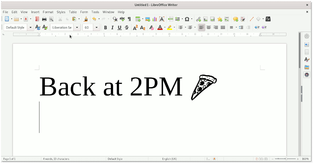
To keep the video call open during breaks, I left my screen share on, showing a message in a word processor, a bit like a status message:

But, it is ugly. I thought it would be cool if there was a way to display this in a nicer way – with all the nice typography and colour of the web. And everybody has a web browser, so surely it could be web-based.
That’s when I came up with the initial idea for Safety Curtain: a quick tool to display a message, whether you’re on a video call or a presentation. I added it to my ideas.txt list.
. . .
A couple of months passed (COVID-19 lockdowns have flown by very fast), and I still hadn’t made a start on the idea. But it was still floating around in the back of my mind.
Why hadn’t I done any work on the idea? Because I was blocked, stuck in the daydreaming phase, and not taking any action.
But, in recent weeks, I’ve absorbed a few thoughts on action that encouraged me to just do it. I’ve documented these in a separate blog post here.
So this week I went from concept to “live” for a tiny product in 24 hours. Not a great feat for some, but for me that’s a big deal.
How I built the product
I knew it could all be done in JavaScript - but how? My knowledge of web development is pretty crap.
The extent of my “development” knowledge is confined to the back-end (Java, Spring, Camel, etc). And even within my domain, I’m also not a hardcore developer. I sit somewhere in the middle, sort of “DevOpsy-coder-lite”. :-)
This means that I run away at the sight of JS. I used to know some JQuery. But, after Googling a bit, I found out that people have moved away from JQuery in the last 10 years. The current trend is for frameworks like Vue or React. I’ve been left behind!
My product idea was just to create a simple web page, with some editable text that looks nice. I didn’t want to spend time learning a new framework for such a simple idea, so I tried to just stick to plain (“vanilla”) JavaScript.
Some of Chris Ferdinandi’s articles were hugely helpful for this! It was good to read Chris’s page on how to show and hide elements with vanilla JavaScript.
I also knew that I would need to know how to trigger actions when a link is clicked (e.g. on the Customise form, or the Full-Screen option), so I also delved a little deeper on event handlers in JavaScript.
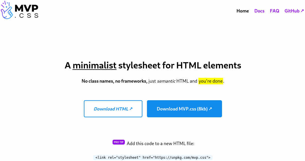
I also took some help with the design. Earlier this year I saw Andy Brewer’s MVP.css make the front page on Hacker News. I bookmarked it when I saw it on Hacker News, in case I needed to remember it later. (Aside: I strongly recommend checking Hacker News every so often, there are usually a few things on there each week that I bookmark for later)

CSS is something I struggle with. Even popular frameworks like Bootstrap and Tailwind require a learning curve.
But MVP.css doesn’t require much learning at all. It just adds styles to some basic HTML elements. It doesn’t introduce any complicated new classes or grid systems, and you can create something nice-looking with little effort:

I wanted to get building quickly, to capitalise on my initial enthusiasm. So finding MVP.css was great timing.
With the JavaScript sorted, and the design, the site started to come together. I also found a very useful tool for creating CSS gradient backgrounds which allowed me to create the first colour scheme. And that was it.
Publishing and launching
The site was essentially finished, but I was drawn to tweaking and fiddling with it.
This final step is the hardest for me: polishing the product, adding a logo or brand, sharing it on social media… I tend to lose confidence at this stage.
But, this time I pushed through, and forced myself to launch and share it on the same day.
I published the site.
I submitted it to Product Hunt. I submitted it at 8pm GMT, and received just 1 upvote, which I assume was mine! But it was still exciting to go through the process of submitting it and putting the product out there.
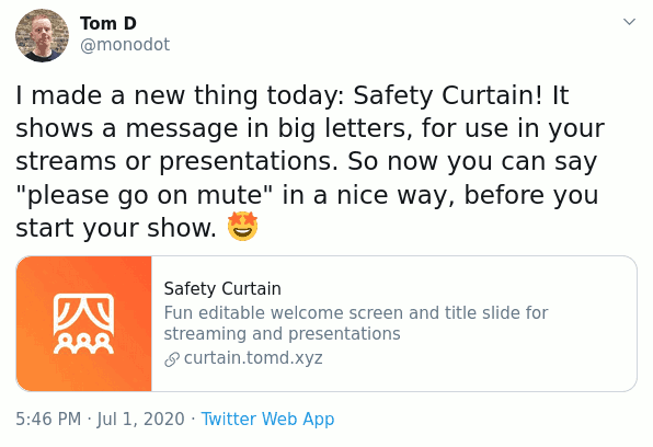
I also tweeted about it:

So I went from writing the first line of code, to having the site up and running in just over 24 hours, using only my free time outside of work. It may not look like much, but for me, it feels like a big achievement to see a working product online in such a short space of time.
And yes it’s a working product. You could use it on a conference call next week with anyone.
Learnings + tricks to get unstuck
So, I shipped something! I got stuck, but not too much.
Here are the three things I did which I think helped me finished something before I had a chance to get bored or stuck:
-
I didn’t use any new frameworks or tools. I could have decided that I needed to learn a JavaScript framework to be able to code my little idea. But this is a distraction. We don’t always need to learn these frameworks to build websites. People have been doing it without React and Vue.js for years. I would love to learn these frameworks, but now wasn’t the time to do that, especially if I just wanted to get a first MVP up and running.
This project was the perfect opportunity to learn some core JavaScript and build a simple, lightweight website.
-
I avoided the thing that I’m not good at (design). When I need to do anything involving design, I tend to get stuck in the weeds. CSS frustrates me. I see other hackers’ products look so polished and well-designed, and I get so frustrated at not knowing how to make something look good. So I tweak CSS for hours.
But not this time! I used the excellent MVP.css bare-bones CSS stylesheet by Andy Brewer. This simple stylesheet got me going. I still got stuck trying to vertically center some text on the page, but I’ve had that same problem for about 20 years…
-
I didn’t set up a domain name. For previous side-projects, I would have spent ages poring over the perfect domain name (2-3 days), then had to register it, set up nameservers and wait while it propagated (another 1-2 days).
Instead, I used the first name I thought of. I set up the website on a subdomain of this site (curtain.tomd.xyz). I use Linode to host my sites, so I was quickly able to set up the new subdomain in my Linode Manager, configure Nginx and publish. You could have done this quicker than me if you use something like Netlify.
The next steps
What are my next plans? Well, Safety Curtain is a finished product now. It’s usable. But I’m always thinking about what to do next. So:
Add more features… I’m going to add more features slowly. I might add a countdown timer, and some more themes. Importantly, I’m expecting the work required for each feature to be very light. This is good, because it means that I might be able to write code for a new feature and publish it within an hour or two. So I can get the feature out there, and keep up my momentum.
To code or not to code… I wonder whether I might explore some no-code options for my next project. As I’m a programmer by trade, I tend to get distracted by the code itself - frameworks, tools, processes - when it simply isn’t required for an MVP. I wonder whether I might have more success using no-code tools.
That’s it for my intro to my latest micro-product. Thanks for reading! Any feedback/questions? Let me know in the comments below.